
Pages & Components
Pages are server-rendered using a component tree system. Each page has a name, path, metadata (SEO, favicons), and sections containing nested components.
Page Structure
Each page has a name, path, SEO metadata, and sections with nested components.
pages:
  - name: home
    path: /
    meta:
      title: "My App - Home"
      description: "Welcome to my application"
      openGraph:
        title: "My App"
        description: "A Sovrium-powered application"
        image: "/og-image.png"
    sections:
      - type: section
        props:
          className: "py-20 bg-gray-900"
        children:
          - type: h1
            content: "Welcome"
          - type: paragraph
            content: "Built with Sovrium"
Page Properties
Each page in the pages array accepts these properties.
Meta & SEO
Comprehensive metadata for search engines, social sharing, and browser display.
meta:
  title: "My App - Home"
  description: "Welcome to my application"
  canonical: "https://myapp.com"
  favicon: "/favicon.ico"
  openGraph:
    title: "My App"
    description: "A powerful application"
    image: "/og-image.png"
    type: website
  twitter:
    card: summary_large_image
    site: "@myapp"
  structuredData:
    type: WebApplication
    name: "My App"
Component Model
Every component in the tree is a node with a type, optional content, props, and children. This recursive model enables arbitrary UI composition.
Recursive composition
Any component can contain children, which can themselves contain children. This lets you build complex layouts from simple, nested building blocks.
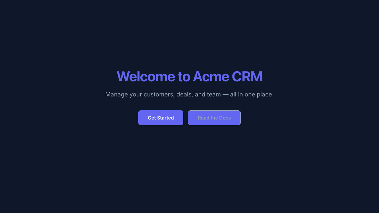
A hero section with heading, description, and call-to-action buttons, all from YAML config.
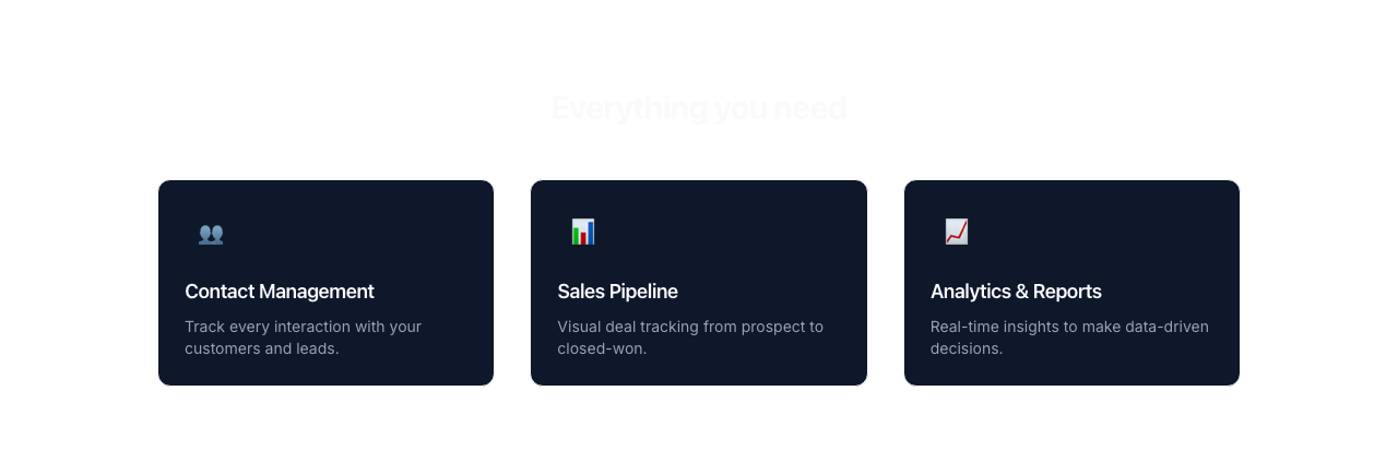
A 3-column features grid using section, grid, and card components with emoji icons.
64 Component Types
Components form a recursive tree. Each can have type, content, props, and children.
Layout
Structural elements that control page layout, sections, and content flow.
sections:
  - type: section
    props:
      className: "py-20 bg-gray-900"
    children:
      - type: container
        props:
          className: "max-w-4xl mx-auto px-4"
        children:
          - type: grid
            props:
              className: "grid grid-cols-3 gap-8"
Typography & Text
Text elements from headings to paragraphs, inline text, and code blocks.
Media & Images
Visual and multimedia elements for images, avatars, video, audio, and embeds.
children:
  - type: image
    props:
      src: "/hero.jpg"
      alt: "Hero image"
      className: "w-full rounded-lg"
Interactive & Navigation
Elements for user interaction including buttons, links, accordions, and navigation.
Cards & Display
Feedback & Utilities
Interactions
Components support 4 interaction types via the interactions property: hover (transform, opacity, scale, shadow changes), click (navigation, scroll, toggle), scroll (parallax, fade-in, sticky behavior), and entrance (animation on first view with delay and duration).
children:
  - type: button
    content: "Get Started"
    props:
      className: "bg-blue-600 text-white px-6 py-3 rounded-lg"
    interactions:
      hover:
        scale: 1.05
        shadow: "0 10px 30px rgba(59, 130, 246, 0.3)"
      click:
        action: navigate
        target: "/signup"
Hover
Transform, opacity, scale, and shadow changes on mouse hover.
Click
Navigate to a URL, scroll to an anchor, or toggle visibility.
Scroll
Parallax effects, fade-in on scroll, and sticky positioning.
Entrance
Animate when element first enters the viewport with configurable delay and duration.
Actions
Components can trigger server-side actions via the action property. Two action types are supported: auth (authentication operations) and crud (data operations). Each action supports onSuccess and onError handlers with navigation and toast notifications.
Auth Actions
Bind a form to an authentication operation. The method property specifies which operation to perform.
# Login form with auth action
sections:
  - type: form
    action:
      type: auth
      method: login
      strategy: email
      onSuccess:
        navigate: "/dashboard"
        toast:
          message: "Welcome back!"
          variant: success
      onError:
        toast:
          message: "Invalid credentials"
          variant: error
    children:
      - type: input
        props:
          name: email
          type: email
          placeholder: "Email"
      - type: input
        props:
          name: password
          type: password
          placeholder: "Password"
      - type: button
        content: "Sign In"
CRUD Actions
Bind a form to a data operation on a table. The operation property specifies create, update, or delete.
# Create record form with CRUD action
sections:
  - type: form
    action:
      type: crud
      operation: create
      table: tasks
      onSuccess:
        navigate: "/tasks"
        toast:
          message: "Task created"
          variant: success
    children:
      - type: input
        props:
          name: title
          placeholder: "Task title"
      - type: button
        content: "Create Task"
Action Responses
Both onSuccess and onError accept a navigate URL and/or a toast notification with message, variant (success, error, warning, info), and duration.
Component Templates
Define reusable components with $ref references and $variable substitution for DRY markup.
# Define reusable templates
components:
  - name: feature-card
    type: div
    props:
      className: "p-6 rounded-lg border"
    children:
      - type: h3
        content: "$title"
      - type: paragraph
        content: "$description"

# Use with $ref
pages:
  - name: home
    path: /
    sections:
      - type: section
        children:
          - $ref: feature-card
            vars:
              title: "Fast"
              description: "Built for speed"