# Theme
The `theme` property defines your design system through optional token categories. All tokens generate CSS custom properties and Tailwind CSS utility classes. Every category is optional — a minimal theme can be colors-only.
## Theme Properties
| Property | Description |
| -------------- | ------------------------------------------------------------------------------------------------------------ |
| `baseline` | `'extend'` (default) keeps Sovrium's default design-system look; `'replace'` swaps it for a neutral floor. |
| `colors` | Named color tokens. Each generates `--color-{name}` and `bg-{name}`/`text-{name}`/`border-{name}` utilities. |
| `darkColors` | Dark-mode color overrides, mirroring the `colors` structure. |
| `fonts` | Typography for heading, body, and mono fonts. |
| `spacing` | Named spacing tokens as Tailwind class strings. |
| `animations` | Keyframe and motion design tokens. See [Animations](/en/docs/animations). |
| `breakpoints` | Responsive breakpoints as pixel values. See [Responsive Design](/en/docs/responsive-design). |
| `shadows` | Named box-shadow tokens, each becoming a `shadow-{name}` utility. |
| `borderRadius` | Named radius tokens, each becoming a `rounded-{name}` utility. |
| `codeBlock` | Syntax-highlighting theme for markdown fenced code blocks. |
## `colors`
Named color tokens as key-value pairs. Each becomes a CSS variable (`--color-{name}`) and Tailwind class (`bg-{name}`, `text-{name}`).
| Property | Description |
| ---------- | -------------------------------------------------------------------------------------------------------------- |
| `{name}` | Token name (e.g., `primary`, `accent`). Used to generate CSS variable `--color-{name}` and Tailwind utilities. |
| CSS output | Generates `--color-{name}` CSS variable plus `bg-{name}`, `text-{name}`, `border-{name}` utility classes. |
```yaml
theme:
colors:
primary: '#3b82f6'
secondary: '#8b5cf6'
accent: '#f59e0b'
background: '#0a0e1a'
text: '#e8ecf4'
muted: '#64748b'
```
## `fonts`
Typography configuration for heading, body, and mono fonts. Supports family, fallback, weights, style, size, line height, letter spacing, transform, and url.
| Property | Description |
| --------------- | ------------------------------------------------------------------------------------------------------ |
| `family` | Font family name (e.g., `"Inter"`, `"Roboto"`). Maps to CSS `font-family`. |
| `fallback` | Fallback font stack used when primary font is unavailable (e.g., `"system-ui, sans-serif"`). |
| `weights` | Array of numeric font weights to load (e.g., `[400, 600, 700]`). Optimizes download size. |
| `style` | Font style: `normal`, `italic`, or `oblique` (default: `normal`). |
| `size` | Base font size as CSS value (e.g., `"16px"`, `"1rem"`). Applied to body text. |
| `lineHeight` | Line height multiplier or CSS value (e.g., `"1.5"`, `"1.2"`). Controls vertical spacing between lines. |
| `letterSpacing` | Letter spacing as CSS value (e.g., `"0.05em"`, `"-0.01em"`). |
| `transform` | Text transformation: `none`, `uppercase`, `lowercase`, or `capitalize`. |
| `url` | Font file URL or Google Fonts URL. Injected as `` in ``. |
```yaml
theme:
fonts:
heading:
family: Inter
weights: [600, 700]
lineHeight: '1.2'
body:
family: Inter
size: '16px'
url: 'https://fonts.googleapis.com/css2?family=Inter:wght@400;600;700'
```
:::callout
**Google Fonts.** Add a `url` to automatically load custom fonts. The URL is injected as a `` tag in the page head.
:::
## `spacing`
Named spacing tokens as Tailwind class strings. Define container widths, section padding, gaps, and component spacing.
```yaml
theme:
spacing:
container: 'max-w-7xl mx-auto px-4'
section: 'py-16 sm:py-20'
card: 'p-6'
gap: 'gap-8'
```
## `baseline` & dark mode
`baseline` controls whether Sovrium's prebuilt components extend the default look or start from a neutral floor.
| Value | Behavior |
| ----------- | -------------------------------------------------------------------------- |
| `'extend'` | _(default)_ Components inherit Sovrium's v1 default design-system tokens. |
| `'replace'` | Components drop the default look and start from a neutral, unstyled floor. |
`darkColors` mirrors the `colors` structure and supplies overrides applied in dark mode, so a single theme can ship both palettes.
```yaml
theme:
baseline: extend
colors:
background: '#ffffff'
text: '#0f172a'
darkColors:
background: '#0f172a'
text: '#f8fafc'
```
## Shadows, Border Radius & Code Blocks
Additional design tokens for elevation, corner styling, and syntax highlighting.
### `shadows`
Named shadow tokens as CSS box-shadow values. Each becomes a `shadow-{name}` utility.
### `borderRadius`
Named border radius tokens as CSS values. Each becomes a `rounded-{name}` utility class.
### `codeBlock`
Selects the syntax-highlighting theme used for markdown fenced code blocks.
```yaml
theme:
shadows:
card: '0 4px 6px rgba(0, 0, 0, 0.1)'
elevated: '0 10px 30px rgba(0, 0, 0, 0.2)'
borderRadius:
card: '0.75rem'
button: '0.5rem'
```
## Responsive Breakpoints & Animations
`breakpoints` and `animations` each have a dedicated reference page:
- [Responsive Design](/en/docs/responsive-design) — breakpoint pixel values and per-breakpoint overrides.
- [Animations](/en/docs/animations) — keyframe and motion tokens.
```yaml
theme:
breakpoints:
sm: '640px'
md: '768px'
lg: '1024px'
```
:::callout
**Breakpoint values are pixel strings.** Each `breakpoints` value must match the `px` format (e.g. `'768px'`) — bare numbers and non-pixel units are rejected by the schema.
:::
## Full Example
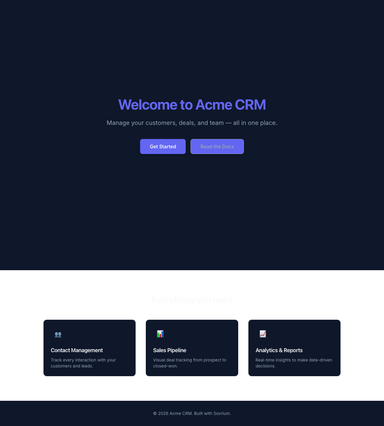
A complete theme configuration combining colors, fonts, spacing, and shadows.
```yaml
theme:
colors:
primary: '#6366f1'
secondary: '#8b5cf6'
accent: '#f59e0b'
background: '#0f172a'
surface: '#1e293b'
text: '#f8fafc'
muted: '#94a3b8'
fonts:
heading:
family: Inter
weights: [600, 700]
url: 'https://fonts.googleapis.com/css2?family=Inter:wght@600;700&display=swap'
body:
family: Inter
weights: [400, 500]
spacing:
container: 'max-w-6xl mx-auto px-4'
section: 'py-16 sm:py-20'
```